Below you will find some examples and guidelines for the use of the Renewd® logo. Partners are allowed to handle the Logo on their website as Official Partners and in online communications. We recommend sending any visuals with our logo to brandteam@renewd.com before usage. The logo and variations can be found in the Media Kit.
Logo/identity
The focal point — an instantly recognisable symbol of the Brand. That is why it is important to use the logo exactly as specified in this guidelines. Our logo is the combination of a simple and modern wordmark and icon. The Icon stands for renewal and movement. We are very proud of our Logo, and would appreciate it if you could follow these guides to ensure it always looks its best. The existing tagline and slogans will not be used in combination with the logo, but as separate elements. Each device in the product range by Renewd will be presented by their principal name in combination with the logo.
2nd by Renewd®
The guides mentioned above also apply for our 2nd by Renewd® label, keeping distance and space for the logo. The leading form of this logo is a mixture of our main colours creating the connection of Renewd® and 2nd by Renewd®.

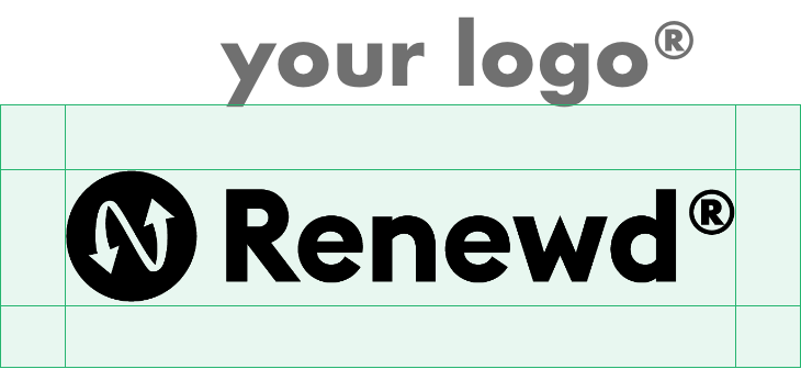
Safe zone
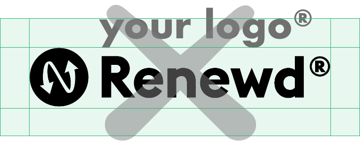
The Safe Zone is equal to half the height of the Icon (marked as × in the diagram). It ensures the legibility and impact of the Logo by isolating it from competing visual elements such as text and supporting graphics. This zone should be considered as the absolute minimum distance, in most cases the logo should be given even more room to breathe.
Logo Variants
For our different devices, Renewd® has variations on our logo applicable to the corresponding device. These can be used in combination with the device or on the device screen as it is displayed in the visual. These logos can also be used as colour variations.



Logo applied on imagery
In the cases where the logo is placed on imagery or on solid colors, the icon in the logo will always be transparent.

